With a new CEO last summer and a $1b acquisition this spring, Yahoo has been changing significantly. Next up is its iconic logo: Tomorrow Yahoo will unveil a new logo to signify the new era. To draw attention to the change, Yahoo has been displaying a different logo every day for the last month.
We were curious about which logo consumers preferred as the best fit for the Internet giant, so we used the Upwave logo testing tool to find out. We asked 12,725 respondents to pick their favorite of five logo variants (randomly selected from the 28 variants released prior to publication).
And the winner is…
Consumers displayed strong and consistent opinions about the variants. The “selection percentage” ranged from 47% for Day 10 (the most preferred) to 6% for Day 21 (the least preferred). Day 10 was rated highly across all age, gender, and geographic groups.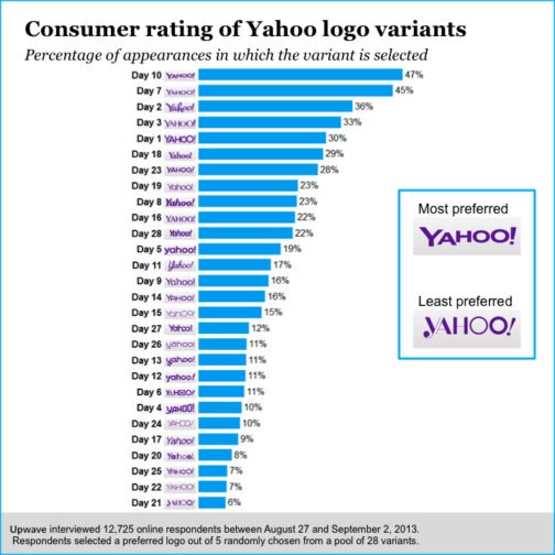
Our large sample size enabled a detailed look at relative preferences for each pair of logos. The most preferred variant, Day 10, is undefeated, having been selected in the majority of head-to-head faceoffs against every other variant.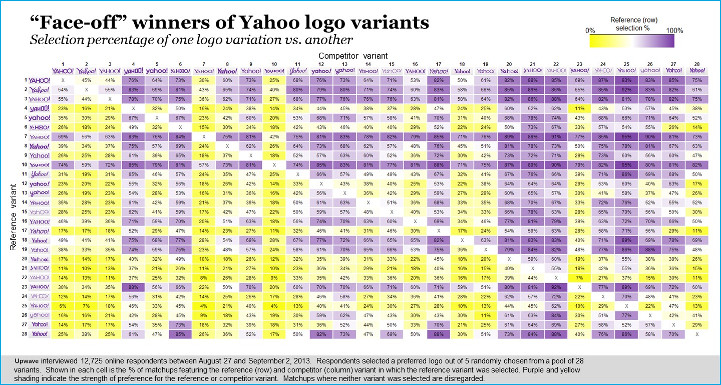
The more logos change, the more they stay the same?
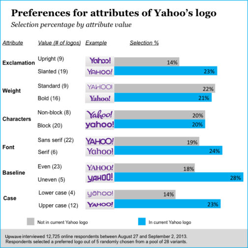
To understand why consumers preferred certain variants, we deconstructed the Yahoo logo into its major design attributes.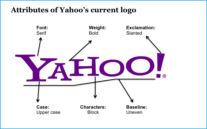 We then classified each variant according to these six attributes. For five of six attributes, consumers preferred the variants with the attribute of the current Yahoo logo.
Our findings from Yahoo’s “30 days of change” campaign suggest it should stick to something familiar. So, for Yahoo’s sake, we hope the new logo announced tomorrow will remind users of its graphical heritage.
Thinking of a new logo? Don’t guess; test.
Upwave has researched consumer opinion on logos for numerous clients, and you can do so for yourself using our fast and affordable logo testing site. Check it out next time your branding needs a face lift!
And, Yahoo, if you ever get bored of Tumblr’s look, we will happily crunch the numbers on that change as well.
Footnotes for our fellow data geeks
- We interviewed 12,725 online respondents from the US between August 27 and September 2, 2013.
- You can download the underlying data here.
- You can analyze the underlying data on Statwing.